0172221937
DIGITAL PHOTOGRAPHY & IMAGING
GCD 61204
PROJECT 01
This project focuses on Collage Design. 2 exercises related to Collage Design, one physical and one digital. The aim is to develop a theme/idea with layers of images with design principles.
PHYSICAL COLLAGE PROCESS
week 1 task

pre-composition #1

pre-composition #2

pre-composition #3
With clippings taken from magazines, I was able to compose three different pre-composition collages for week 1's task. This was further to be checked by my tutor and I was able to finalise a physical collage from one of the three pre-composed collages.
PHYSICAL COLLAGE OUTCOME
After refining the layout for my collage design, all clippings were pasted down onto a paper with glue.

DIGITAL COLLAGE PROCESS
week 2 task


From tutorial we practiced on the basics of making digital collages by learning on using the quick selection tool, and masking and layering on Photoshop. With that, I was able to compose three variations of digital collages.

collage 1

collage 2

collage 3
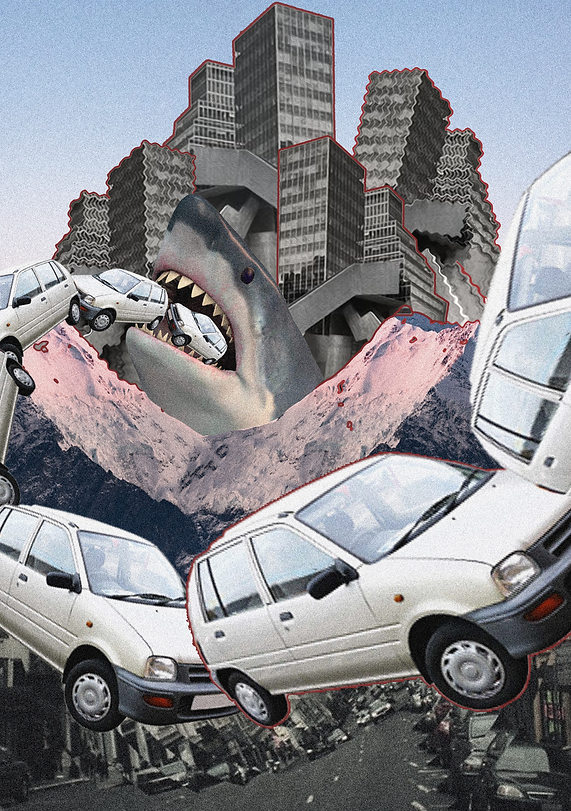
DIGITAL COLLAGE OUTCOME
After receiving feedback on my collages, I had chosen one collage to refine and further add elements onto. This is the final outcome.

PROJECT 1: DIGITAL IMAGING - YOU IN HEARST MANSION
In week 3, we were tasked to practice on Photoshop blending modes, after learning the basics, we were tasked to create our own scene with our own image inserted. This is the documentation of the progress.

After cropping out my image, I resized the figure and colour corrected it. To match the background image quality, I added a noise filter.

To make the reflection blend into the water, I brought down the lightness of the image and added a ripple filter over it, to blend into the water.
'YOU IN HEARST MANSION' OUTCOME

WEEK 4 TASK: BRUSH, LAYER, FILL IN COLOUR
For tutorial this week, we practiced on the fundamentals of filling in colour to a black and white image. On this session, I was able to learn how to colourise any black and white image in just a few simple steps.

By using brush tool and colour selections, we coloured this image based on our own creativity, recoloring the features of the image subject.

BRUSH, LAYER, FILL IN COLOUR OUTCOME
Having practiced on the exercise given, I chose a black and white image provided by my tutor and was able to recolor the image.


WEEK 5 TUTORIAL EXERCISE: DOUBLE EXPOSURE PRACTICAL
In this tutorial, we practiced on an exercise on how to overlay images to create a double exposure effect.
With the given elements for the image, this was the portrait that I was able to create for the exercise.
PROJECT 2A: DOUBLE EXPOSURE
For this project, we were tasked to create a double exposure image of our own portrait. As I have completed the double exposure exercise during tutorial the week prior, I was able to create my own double exposure image succcessfully.

First, I chose a portrait that I liked of myself with a minimal background so that I could mask my figure easily in the next step.

I inserted my image onto Photoshop, and proceeded to mask my figure into a new layer to edit. On this step, I color corrected my image and adjusted the contrast of the image by using the curve.

Then, I placed an image on top of the masked layer, and created a clipping, which allowed the image to be 'inserted' into the mask layer.
I had to be creative by adjusting the placement of the image. Once everything is in place, the next step came in.

I uncovered parts of my face and body by using the eraser tool on the clipped images. I further added more elements into the image, to create a better composition. I also added a layer of background colour, to blend in the double exposure image into the background.

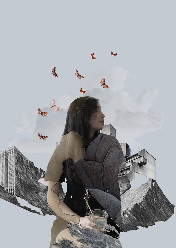
For the finishing touches, I added some butterflies and clouds to add a touch of whimsical look to my image. I further adjusted the color value of the rest of the elements to blend in with the rest of the image.
DOUBLE EXPOSURE IMAGE OUTCOME
This is the final outcome of the double exposure project. It was very fun to compose as there are so many ways of executing the design. My design was inspired by brutalism architecture, to showcase the bare and raw nature of materials, appreciating the textures.

WEEK 6: PHOTO MANIPULATION EXERCISE
.png)

On this week, we worked on finding inspiration and idea development for the next part of the project, which is photo manipulation.
I started off with finding inspiration and making a moodboard.
Then, I sketched out some ideas, with the concept of combining two random objects and making them look like one.
PROJECT 2B: PHOTO MANIPULATION
For this project, we were tasked to create a photo manipulation image. Moving onward from the ideas I had previously, I was able to create one successfully.

Object #1: Keyboard

Object #2: Chocolate bar
I set up a white and plain background, and proceeded to do a photoshoot for the items chosen. I did this so it will be easier to crop the objects later in Photoshop.
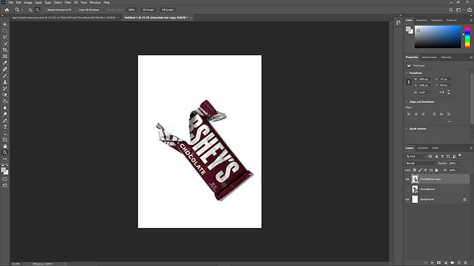
On Photoshop, I placed the photo of the chocolate bar into a layer, and started the editing process.

Then, I proceeded to mask and remove the chocolate inside so that only the wrapper remains.

Adding the keyboard into a new layer, I did the same thing of masking the photo and removed the background so only the keyboard is visible.

After that, I moved the keyboard layer beneath the chocolate wrapper so that the keyboard looks like it is 'wrapped' by the wrapper.

To add more secondary elements, I cut out pieces of the keycaps from the keyboard and placed them around the 'chocolate bar' to resemble chocolate chunks.
After everything is in place, I added shadows by painting black strokes and using the gaussian blur filter.


PROJECT 2B: PHOTO MANIPULATION OUTCOME
This is the final outcome of the image that I was able to create. It was an overall very fun yet simple project, as we were able to experiment with whatever objects we desired, thus this product image was able to be produced.
FINAL PROJECT: SELF TITLED
Self-titled is an exploration project for us to express our own individuality and reflect our personality into digital art self-expression.
The main idea is to build up self-confidence and discover our interest.
We began the process of idea development by writing a biography about ourselves. In this task, I was able to question myself what are my interests and purpose, which sparked ideas for the gif that we are to produce.

After the brief biography, we were tasked to write a statement of our own work, which was a very enjoyable process as I love explaining about the meaning and philosophy behind my designs.
.png)
The last step of this task is to make a mood board in relation to the topic that we are developing on. My mood board was very heavily inspired by photomanipulation and follows the theme of retro-furturism, connecting to the Interstellar space theme that I was going for.
.png)
On Photoshop, I composed two variations of photo manipulation which will then be transferred to Aftereffects for animating and finishing. These are the two variants of the digital poster.


After deciding on which poster I liked better, I worked on it and refined the composition of the poster to bring forward to Aftereffects for animating.
A brief description is provided for my design process and thinking.
I imported my .psd poster into After Effects, and started to work on each of the elements, animating them to make a short gif.

After importing the file and checking that all my desired components are in the composition, I started the animation process of this poster.

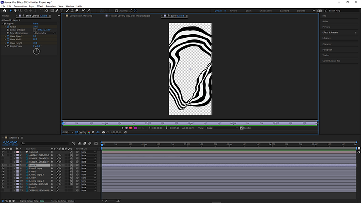
I started with animating the swirly images, I added a ripple effect to them and tweaked the settings of the editor to get the sort of ripple effect that I desired.

After that, I animated the text by adding a twist effect to it, in which in the final animation the text will seem to warp and twist as it plays.

For the subject in the middle, I added a block dissolve effect which gave the images a "evaporating into thin air" look. The final animation of these images will show the subject slowly fading away.

Last but not least, for the background I wanted to create a warping type of visual, to which I applied a CC Lens effect to the background image and animated it. This gave it a fish eye lens effect which I thought was the finishing touch for the animation as it needed some depth, and this effect was perfect for it.
FINAL PROJECT:
'DO NOT GO GENTLE INTO THAT GOODNIGHT' OUTCOME
ARTIST STATEMENT:
“Do not go gentle into that goodnight; Old age should burn and rave at close of day. Rage, rage against the dying of the light.”- Professor Brand, Interstellar. This poster design was greatly inspired by that quote, which talks about how when we are faced with death, we shall not willingly accept it but instead should fight it with vigor and intensity.
While I am far from facing death, this quote touched me which motivated me to work through all of my challenges until the very end; that no matter what happens in the end, I shall and will give my all.
Using distortion and other types of effect, this animation is supposed to visualise time, warping with us humans, juxtaposing between the permanence of time and how impermanent, yet important we are to the world.
To conclude the end of this project as well as the module, I am eternally grateful for the learning opportunities I had as well as for Mr Martin, who guided me through this module. I have come out of this module having learnt a lot about using Adobe Photoshop as well as After Effects. I believe the skills that I've picked up in this module will be utilised in my future works as it these softwares are extremely versatile tools that can aid me in producing better presentations as well as designs in my core studies.
I extend my thanks to my tutor Mr. Martin for his dedication as well as my fellow peers who inspired me with their works along the way.
_JPG.jpg)